arkancide_is_real
SHORT BUT IMPORTANT THREAD
I am going to show you something that we shouldn’t see in the Johns Hopkins data.
I want you to rebut this with any theories you have.
Because if it can’t be debunked it means the #covid19 data is synthetic.
Do you see the pattern?@richardursomd @JamesTodaroMD @LynnFynn3 @cnpaiva @NoWackyScience @KillAuDeepState #covid19 #plandemic #dominion pic.twitter.com/C2oT84OZEy
— arkancide_is_real (@Arkancideisreal) November 28, 2024
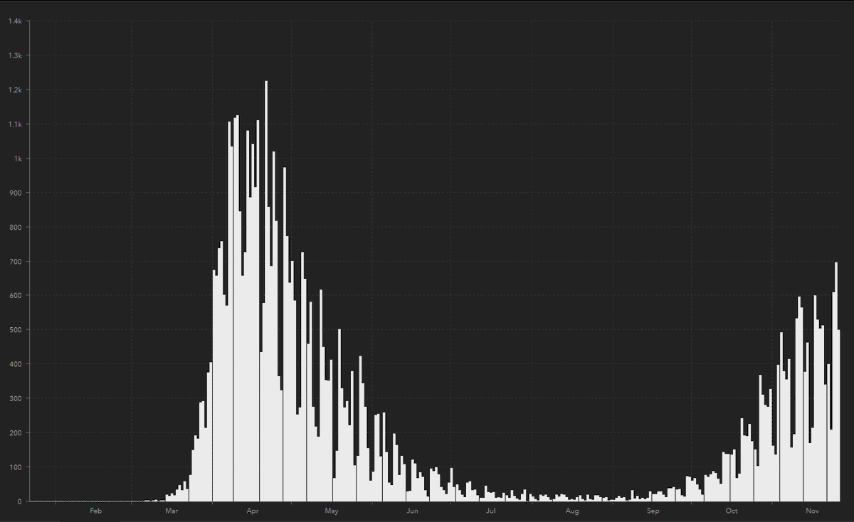
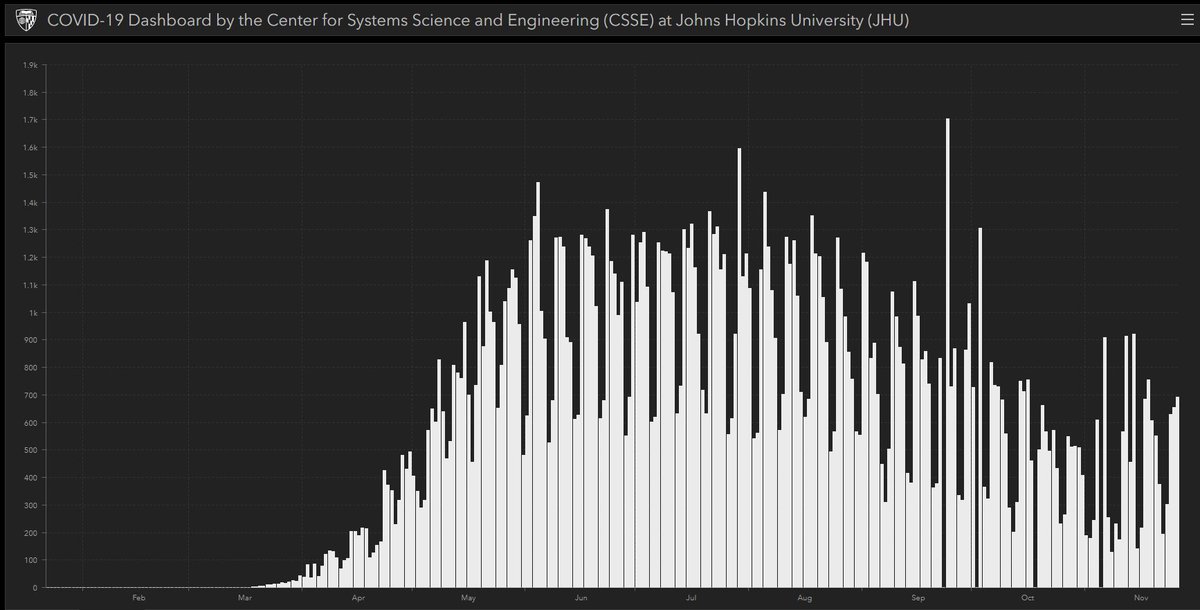
What are we seeing? A weekly pattern of dips. Not random, it’s a pattern.
In the US data it is Monday and Tuesday. In the UK and Brazil it’s Sunday and Monday.
Brazil is on a similar time zone as the US and the @JohnsHopkinsSPH data is meant to be UTC.
How do we know it’s a pattern?
Proof, thanks to @JML21071664 we have analysed the data using MCA (a factor analysis method).
It minimises the effect of confounders and looks at patterns in data.
sciencedirect.com/topics/compute…
What did we find?
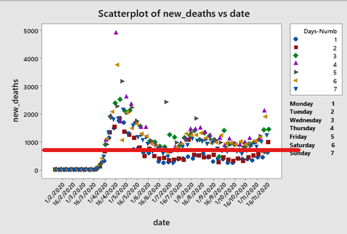
Two days of the week (e.g. Monday and Tuesday in the US data) had massively and repeatedly lower death rates than the neighbouring days.
In these plots “Day-1” is the pattern for deaths on Monday/Tuesday compared to all the other days (“Day-0”).
MCA separates different signatures in the data, so we can look at everything together and see if any pattern stands out compared to other patterns (components) 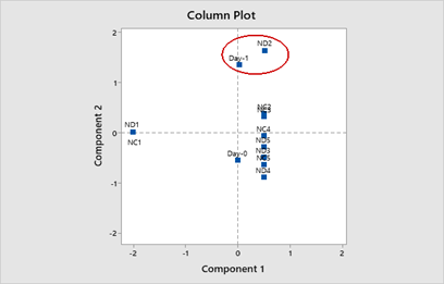
You can see that all the other patterns (dots on the graph) are randomly distributed but the “Day-1” component sticks out like a sort thumb in all comparisons.
All the other dots here represent new cases (NCx) and new deaths (NDx) 
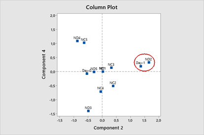
The only statistical explanation for this is that there is an independent pattern driving a lower death rate on two days a week in the data sets of the most discussed countries.
So, now we need to ask whether there is an organic explanation….
“Oh but it’s the weekend” you all shout.
Nope. Weekend death rates in hospitals are traditionally higher than weekday deaths. It’s a known phenomenon.
Anybody that’s been an intern will know why

“Oh it’s just that they are dying but not registered until Monday”
No.
(1) The deaths on the JHU dashboard are recorded for the day. There are no corrections up or down.
and….
(2) there is no Monday “bump”
The reduction on the two days is about half the rolling average, so the next day figure should be twice the rolling average.
It’s not.
So, @JohnsHopkinsSPH please feel free to offer an explanation.
I have some other questions for you….

By the way I touched on this a while back and still haven’t had a reasonable account of how this data is gathered.
But I know for a fact it isn’t “from reading media reports” for 600,000 cases a day by a team of 6 people…
It's time for a quick thread on the @WHO @Worldometers and @JohnsHopkins dataset that underpins the whole #covid19 #pandemic
Where does it come from and is it even real? https://t.co/NjTbrW05bT
— arkancide_is_real (@Arkancideisreal) July 15, 2024
There is some urgency to this information because the pressure on Johns Hopkins is mounting.
Their response was to censor those that question them.
That probably tells us all we need to know.
@JHUNewsLetter
